Building an App with MobileUI and Kotlin - Part 1
What is this about?
This tutorial shows you how to build a cross-platform app for iOS and Android with
- the MobileUI Framework for cross-platform native user interfaces,
- Kotlin JVM (which is ≠ Kotlin Native) on iOS and Android,
- Retrofit and Kotlin Coroutines to fetch data from a web service.
The app, we're building is a simple weather app 🌦 displaying the current weather from openweathermap.com.
🚀 Getting Started
To start this project, you need Android Studio and two additional plugins. Let's go!
- Get Android Studio from developer.android.com/studio
- Register for MobileUI Purple at mobileui.dev and
- download the MobileUI Purple Plugin
- download the RoboVM Plugin (macOS only)
Then, install Android Studio and both downloaded plugins.
Note: If you are having trouble with installation or project creation, please refer to the MobileUI Documentation.
Create the Project
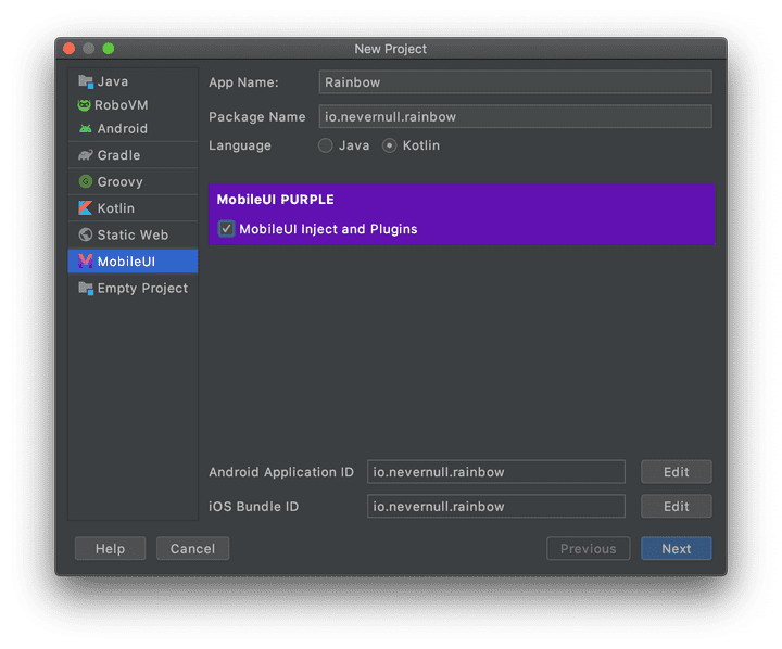
To start with a Kotlin JVM cross-platform project, the MobileUI Plugin comes with a handy wizard. Open Start a new MobileUI project either from Android Studio's launch screen or from the File -> New -> Start a new MobileUI project menu.
You will be presented with this screen. Please give your app a name ("Rainbow" 🌈 in this example) and select Kotlin as language. Also tick the MobileUI Inject option. It will configure dependency injection and MobileUI plugins setup into the project.
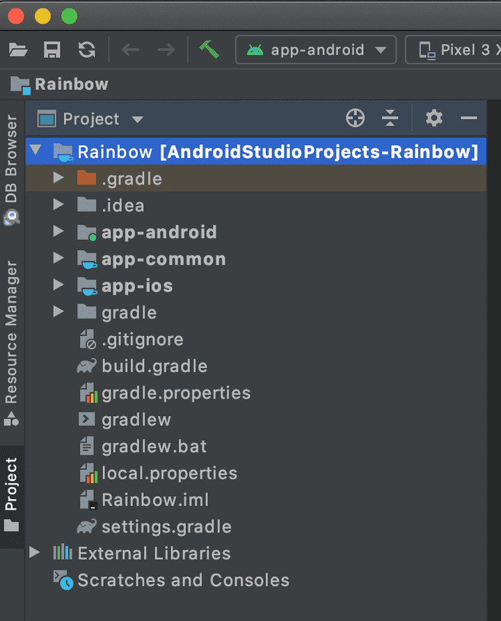
Then, skip through the wizard with default settings. You will end up with a 3-module Gradle project looking like this:
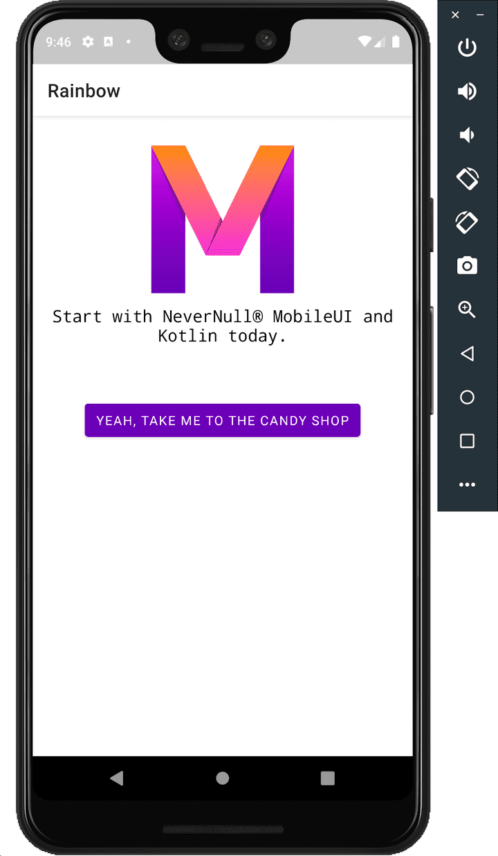
You can now start the project on a connected Android device or Android emulator. Once Android Studio has built and started the app, it should look like this:
Okay, you are ready to get started with your own code now.
📱 Building the UI
The first step is to build the user interface with the help of the MobileUI cross platform layout system. You can do this by simply altering the file Main.layout.xml which can be found in the folder app-common/main/assets. To decouple the layout development from the business logic, you can use static dummy data as a first step. Later on, you will use MobileUI's UI Data Binding to display dynamic information.
Custom Font
First, we use a non-standard font to make your app stand out. Let's take Quicksand which is a friendly sans-serif font.
- Go to googlefonts and download the Quicksand font family as zip file.
- Extract the ZIP file .
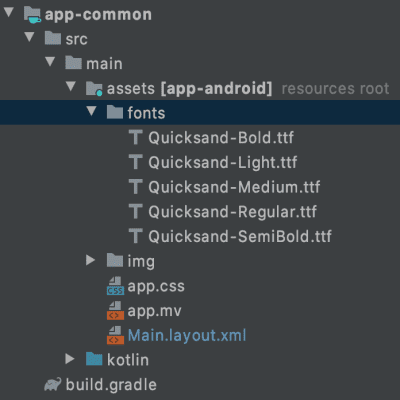
- Copy the contained static TTF files into the folder
app-common/src/main/assets/fontsas shown below (create the folder if needed).
The fonts are automatically picked up by MobileUI from here.
Changing the Layout
As preparation for your layout, you can replace the Main.layout.xml's content with the following basic structure:
<Layout xmlns="urn:nevernull:mobileui:layout">
    <style>
        TextView {
            fontFamily: Quicksand;
            textColor: white;
            fontSize: 18;
        }
        .semibold {
            fontFamily: Quicksand SemiBold;
        }
        .table > TextView {
            textColor: black;
            fontSize: 16;
            width:0dp;
            layoutWeight: 1;
        }
    </style>
    <ScrollView backgroundColor="#10103a" height="fill_parent"
       width="fill_parent">
        <LinearLayout height="fill_parent"
          orientation="vertical" width="fill_parent">

            <!-- Our views go here -->

        </LinearLayout>
    </ScrollView>
</Layout>
You can see, that there are 3 CSS styles defined here. The first style applies the Quicksand font, color white and font size 18 to all TextView elements. The semibold CSS class allows you to apply the SemiBold variant of the font to arbitrary Views. Later on, you need the table class which is discussed further below.
The basic layout is a LinearLayout with vertical orientation. It is wrapped in a dark blue ScrollView to enable scrolling on small displays or in landscape mode. You can then add all UI components as content of the LinearLayout . They will be arranged vertically below each other in order of appearance.
Start the Live Preview 📲
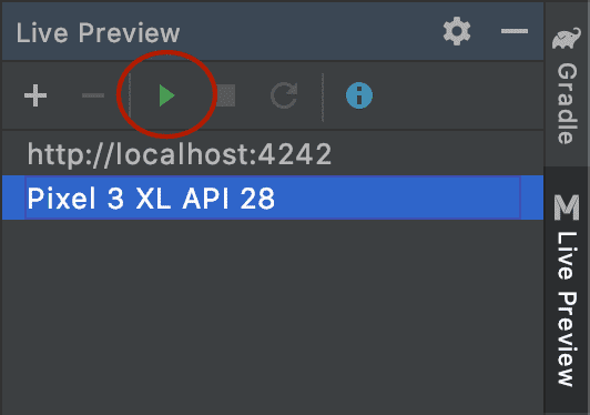
After adding the font files and changing the layout, you should restart the app with Android Studio. As this takes a few seconds each time, you can from now on change into Live Preview mode. All your additions and changes to the layout will be reflected within the running app instantaneously. To activate Live Preview:
- Open the Live Preview Panel on the right in Android Studio,
- Make sure, your running Android Emulator or device is listed there,
- Press the Play Button to activate the Live Preview.
Whenever you save the layout file now, you can see your changes in your app. So, let's start adding elements (as children of the LinearLayout shown above!).
Note: If you need more information on activating the Live Preview, please refer to the Official Live Preview Docs.
The City Banner
The first child of our LinearLayout is a FrameLayout displaying the name of the city and a reload button that will allow refreshing the weather information later on.
<!-- City Banner -->
<FrameLayout padding="16dp" width="fill_parent">
    <TextView text="Stuttgart" class="semibold" fontSize="24"
        horizontalAlign="center" verticalAlign="center"
        textColor="#fdbf00" />
    <Button text="↻" backgroundColor="transparent" cornerRadius="20dp"
        fontWeight="@{device.isAndroid ? 'bold' : 'regular'}"
        width="64dp" height="64dp" horizontalAlign="right"
        padding="0dp" textColor="white"  fontSize="32"/>
</FrameLayout>
The city name is realized with a TextView with yellow textColor. It has the class="semibold" attribute which applies the above defined CSS class to it.
The refresh Button shows the UTF symbol for reload (text="↻") with a large font size. Its backgroundColor is transparent. However, it has an on-touch effect, which is explicitly shaped with the cornerRadius and the width and height attributes.
When experimenting with the icon, we found, that the font should only be bold on Android and not on iOS. This is done with MobileUI's templating mechanism. The expression
@{device.isAndroid ? 'bold' : 'regular'}
computes the value to be bold on Android and regular on iOS.
TextView and Button are contained in a FrameLayout. By using horizontalAlign and verticalAlign attributes, we arrange the elements in the layout as shown.
Weather Icon and Date
The next section adds a weather icon and current date information.
<!-- Weather Icon and Date -->
<LinearLayout horizontalAlign="center" marginRight="8dp">
    <ImageView height="80dp" width="80dp"
      href="#{'https://openweathermap.org/img/wn/09d@2x.png'}"
      scaleType="fitCenter" />
    <LinearLayout orientation="vertical" verticalAlign="center">
        <TextView fontWeight="bold" text="12:14h" />
        <TextView text="Aug 2, 2020" />
    </LinearLayout>
</LinearLayout>
Icon and text block are arranged within a horizontal LinearLayout. This snippet uses MobileUI's binding mechanism already, to bind an PNG image via a static URL to the ImageView. MobileUI will download, cache and display the image for us. This URL will be dynamically computed later on to have actual weather icon appear at this position.
To create two lines of text, the TextViews are wrapped in a LinearLayout with vertical orientation.
The Temperature Information
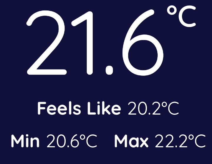
Now, let's drill into the temperature information a bit. On the one hand, we have the main temperature, but there are also maximum, minimum and felt temperature values. Let's display them like this:
<!-- Temperature Information -->
<LinearLayout horizontalAlign="center">
    <TextView fontSize="90" text="21.6" />
    <TextView class="semibold" fontSize="30" height="fill_parent"
        paddingTop="20dp" text="°C" textVerticalAlign="top" />
</LinearLayout>
<LinearLayout horizontalAlign="center">
    <TextView fontWeight="bold" text="Feels Like " />
    <TextView text="20.2°C" />
</LinearLayout>
<LinearLayout horizontalAlign="center" marginTop="8dp">
    <TextView fontWeight="bold" text="Min " />
    <TextView text="20.6°C" />
    <TextView fontWeight="bold" marginLeft="16dp" text="Max " />
    <TextView text="22.2°C" />
</LinearLayout>
We arrange them with different LinerLayouts. Note, that the °C for the large temperature display is a second TextView. It has smaller font size and the textVerticalAlign is top to simulate a superscript. A workaround with a padding of 20dp helps with aligning it with the top line of the large font.
The other temperatures are LinearLayouts containing labels and TextViews vor the values that will come from the service response later on.
The Data Card
The following card contains additional information like pressure and humidity. It is a small table for 4 values on top of a card.
<!-- Data Card -->
<CardView cardBackgroundColor="#f2fbff" cornerRadius="10dp"
    margin="32dp" marginTop="48dp" width="fill_parent">
    <LinearLayout orientation="vertical" padding="20dp"
        paddingBottom="28dp" width="fill_parent">
        <LinearLayout class="table" width="fill_parent">
            <TextView fontWeight="bold" text="Pressure " />
            <TextView text="1012 hPa" />
            <TextView fontWeight="bold" text="Humidity " />
            <TextView text="43 %" />
        </LinearLayout>
        <LinearLayout class="table" marginTop="8dp" width="fill_parent">
            <TextView fontWeight="bold" text="Wind " />
            <TextView text="1.5 km/h" />
            <TextView fontWeight="bold" text="Visibility " />
            <TextView text="10 km" />
        </LinearLayout>
    </LinearLayout>
</CardView>
The card is created with a CardView. It can have a distinct cardBackgroundColor and the cornerRadius determines the "roundness" of the corners.
Tables are currently not supported as own layout element. Therefore, this snippet is using LinearLayouts, to make a table-like layout. This can easily be done with the layoutWeight attribute of child elements within a LinearLayout. We apply width="0dp" layoutWeight="1" to all contained TextViews to let them distribute evenly across the card. To apply this, we define the current style in the <style> section of the layout:
.table > TextView {
    textColor: black;
    fontSize: 16;
    width: 0dp;
    layoutWeight: 1;
}
This style applies the layoutWeight and width attributes to all children of elements marked with the table class. As you can see in the XML-listing above, the parent LinearLayouts have the class="table" attribute, so that this style is automatically applied to all the contained TextViews.
Sunrise and Sunset
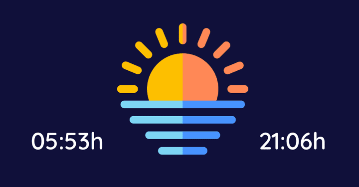
The last thing we get with a service response are the times for sunrise and sunset. We combine it with a free sunrise/sunset icon making it look a fancy.
- Download the sunset icon as PNG from flaticon.com. It's name is
beach-sunset.png. - Copy the PNG to
app-common/src/main/assets/beach-sunset.png - Then restart the app to make the image available and continue editing the layout.
<!-- Sunrise and Sunset -->
<LinearLayout horizontalAlign="center" marginTop="16dp">
    <TextView class="semibold" marginRight="10dp"
        text="05:53h" verticalAlign="bottom" />
    <ImageView height="100dp" href="beach-sunset.png" width="100dp" />
    <TextView class="semibold" marginLeft="8dp"
        text="21:06h" verticalAlign="bottom" />
</LinearLayout>
Yet again, you can build the required layout with some LinearLayouts. Both TextViews vertically align on the bottom. The icon is displayed with a fixed size of 100dp * 100dp and the complete layout is centered.
Fine-tuning the Android native UI
On Android, we would like to get rid of the ActionBar, which is automatically displayed with the default project. Additionally, we like to have a colored status bar as shown below:
To achieve this, you can add three lines of code in the MainActivity.onCreate(...) method as follows (find the MainActivity.java in the app-android module):
override fun onCreate(savedInstanceState: Bundle?) {
    //colorize the status bar
    window.decorView.setSystemUiVisibility(FLAG_DRAWS_SYSTEM_BAR_BACKGROUNDS)
    window.setStatusBarColor(Color.parseColor("#10103a"))

    super.onCreate(savedInstanceState)

    //hide the ActionBar
    supportActionBar?.hide()

    setContentView(MobileUILayout(this, "Main.layout.xml", MainController { url -> openUrl(url) }))
}
Fine-tuning the iOS native UI
On iOS, we don't need the Navigation bar on top of the screen. This means, we can simply use the MainUIViewController as root controller.
To achieve this, open the file app-ios/src/main/kotlin/Main.kt and change the body of the function didFinishLaunching(...) like this:
override fun didFinishLaunching(application: UIApplication) {
    MobileUIIos.initComponent()

    var windowRef = UIWindow(UIScreen.getMainScreen().bounds)

    // Directly use MainUIViewController as rootViewController
    windowRef!!.rootViewController = MainUIViewController()

    // Make the window visible.
    windowRef!!.makeKeyAndVisible()
}
Additionally, the text in the status bar should be white instead of black (so-called light content mode on iOS). To realize this, open the file app-ios/src/main/kotlin/MainUIViewController.kt and add the following function to the controller:
override fun getPreferredStatusBarStyle(): UIStatusBarStyle {
    return UIStatusBarStyle.LightContent;
}
Now, it's time to run the app on iOS by creating and starting a new RoboVM launch configuration. If you are not sure, how to do this, you can follow the Documentation on launching the app on iOS.
The Result
The result when started on the Android emulator and the iPhone simulator should look like this:
Yeah, the layout is a wrap! In the next part of the building-an-app series, you are gonna fetch the weather data for real! So, keep going and awaken your UI with dynamic data!
And always remember: The cloudy days 🌧 are best for coding ⌨️ 🤓!
